Key Points
- Originating in 18th-century Japan, candlestick charts revolutionise trading with a visual emphasis on trader psychology.
- Components such as the Real Body and Shadows/Wicks vividly depict market sentiment and price movements.
- By their design, Candlestick charts offer a more intuitive understanding of market trends than bar charts.
- Basic patterns, categorised into bullish and bearish, are vital indicators of potential market shifts.
- The accuracy of candlestick patterns highlights market tendencies, not certainties, emphasising the importance of context in trading strategies.
Candlestick charts, a cornerstone in financial trading and analysis, offer a vivid and intuitive means of understanding market movements. Their origin, components, and patterns present a rich tapestry of information that, when decoded, can significantly enhance trading strategies.
This article will delve into the comprehensive details of candlestick charts, from their historical roots to the intricate patterns that inform trading decisions today.
The Historical Tapestry of Candlestick Charts
Candlestick charting emerged in Japan over 300 years ago, developed by a legendary rice trader named Munehisa Homma.
In the 1700s, Homma discovered that traders’ psychology played a crucial role in the rice market’s price movements beyond the supply and demand dynamics. He developed the candlestick method to visualise this interplay of emotions in trading, providing an innovative tool that significantly predated its adoption in Western financial markets.
This method marked the beginnings of behavioural finance and laid the groundwork for a charting technique that would become a global trading language.
Unpacking the Anatomy of Candlestick Charts
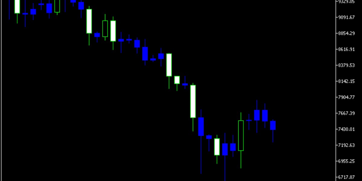
A candlestick chart is a graphical representation of price movements in a given timeframe. Imagine it as a series of individual ‘candlesticks,’ each capturing the highs, lows, opening, and closing prices within that specific period.
To truly make sense of the insights offered by this chart, it becomes vital to understand the essential components that construct each candlestick:
Real Body
The real body of a candlestick is a rectangular area that shows the range between the opening and closing prices of the trading period.
The colour of the real body provides immediate visual feedback on the market’s direction: a black or red body indicates that the closing price was lower than the opening price, suggesting a downward movement.
Conversely, a white or green body signifies an upward movement, with the closing price higher than the opening price.
Shadows/Wicks
Extending from the real body are the shadows or wicks, which are thin lines representing the high and low prices during the trading period.
The upper shadow shows the highest price reached, while the lower shadow indicates the lowest price. These extensions provide insights into the volatility and price extremes within the timeframe.
Candlestick vs. Bar Charts: A Visual Duel
While both candlestick and bar charts serve the same purpose of depicting price movements, their presentation styles differ significantly, affecting their usability and interpretative ease.
Bar charts, with their linear representation and single-colour scheme, effectively convey the open, closed, high, and low prices but need a more immediate visual impact than candlestick charts.
Candlestick charts, with their colour-coded Real Bodies and prominent Shadows, offer a more nuanced view of market dynamics. Their discernible patterns offer enhanced readability and analytical depth compared to bar charts, necessitating closer scrutiny.
The Lexicon of Candlestick Patterns
Delving into candlestick patterns, traders encounter a vocabulary of market sentiment. These patterns are broadly bullish and bearish, indicating potential price increases or decreases. Therefore, each pattern, from the Bearish Engulfing to the Bullish Rising Three, is a marker for interpreting market behaviour.
Bullish Patterns:
1. Bullish Engulfing:
The Bullish Engulfing pattern, seen in a downtrend, unfolds when a long, white actual body engulfs a smaller, black real body, signalling a potential reversal as bullish momentum gains strength.
In this visual drama, an increase in trading volume acts as applause, reinforcing the pattern’s significance. Traders witnessing this bullish spectacle may interpret it as a cue for a possible shift in market sentiment.
2. Bullish Harami:
The Bullish Harami quietly signals a potential shift from bearish to bullish sentiment. This pattern unfolds with a small white/green candlestick fully encapsulated within the body of a preceding large black/red candlestick.
Traders often interpret this visual cue as a subtle indication that bullish forces may be gaining traction after a period of bearish dominance.
3. Bullish Harami Cross:
Similar to the Bullish Harami but with the small candlestick being a Doji (where opening and closing prices are almost the same), indicating indecision but with a potential bullish turnaround.
The opposite of the upside-down negative harami is the bullish harami. A little real body (green or white) forms inside the large real body (red or black) of the previous day, indicating that a decline is underway.
4. Bullish Rising Three:
This pattern starts with a long white/green candlestick, followed by three small body candles that stay within the range of the first candle and concludes with another long white/green candle. It indicates a continuation of the bullish trend. The bullish rising three shows a three-day price drop without new lows, indicating bulls are preparing for an upcoming rally with a transition.
A minor deviation occurs with a small gap following a long upward movement on the second day, indicating a change. The pattern is the same in every other way; it only has a slightly different appearance. That variation is called a “bullish mat hold” when it happens.
Bearish Patterns:
1. Bearish Engulfing:
Opposite the Bullish Engulfing, this pattern features a small white/green candlestick followed by a larger black/red candlestick that engulfs the former, indicating strong selling pressure. When sellers exceed purchasers during an uptrend, a bearish engulfing pattern forms. A long red (black) real body swallowing a small green (white) real body reflects this action. The trend suggests that sellers are in charge again and that the price may drop further.
2. Bearish Harami:
This pattern emerges when a small black/red candle is completely enveloped by a larger white/green candle from the previous day, suggesting a potential bearish reversal.
A little black or red real body entirely inside the white or green real body from the previous day is called a bearish harami. Therefore, the pattern indicates that the purchasers need to be made aware of themselves. A down candle suggests a potential decline; however, subsequent price increases indicate the uptrend may still proceed as planned.
3. Bearish Harami Cross:
When an uptrend is underway, and an up candle is succeeded by a doji—a session in which the candlestick’s open and finish are almost equal—a bearish harami cross is formed. The actual body of the previous session contains the doji. The bearish harami has the same effects.
4. Bearish Falling Three:
It starts with a long black/red candlestick, followed by three small bodies within its range. It concludes with another long black/red candle.
This pattern suggests the continuation of a bearish trend. It all begins with a really bad day. Three tiny real bodies that go upward but remain inside the range of the first major down day follow this. When the fifth day experiences yet another significant decline, the pattern is complete. It indicates that sellers are again in charge and that the price may drop.
The Realism of Pattern Accuracy
While the allure of candlestick patterns is undeniable, their predictive accuracy is not absolute. These patterns represent tendencies in price movement rather than guarantees. Myriad factors influence them, including market context, volume, and external events,
Traders often combine candlestick analysis with other indicators to validate potential trends, acknowledging that while patterns provide valuable signals, they are best used as part of a broader strategic framework. This nuanced understanding of pattern accuracy underlines the importance of experience and discretion in trading, ensuring that decisions are informed by a comprehensive analysis rather than reliance on any single indicator.